Website Redesign
In an effort to help drive change in Infosurv’s website design, I rebuilt it using the Jekyll static-site generator. I took most of the original design’s components and made tweeks to them to both look and function better. It was my desire to remove alot of the cruft that has built up and make our site faster for end users and less server/database intensive on the backend.

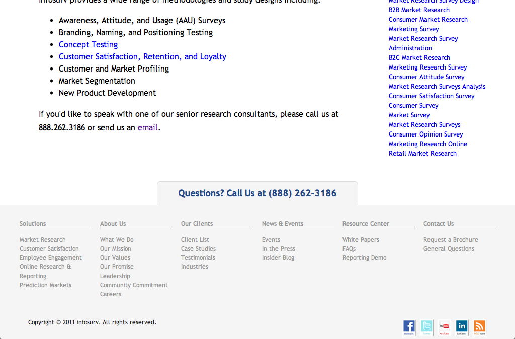
I removed the dropdown menus to allow for future deployment to iOS devices. (Yes, :hover does work, but you would need to realize that something is hoverable and touch it to make it visible, not nearly as intuitive as simply giving the links to the users.) To keep the links available I moved them to the footer:

I redesigned our contact form with the goal of making it simplier for end users. Before it had a captcha system and required more fields. Now it would look like this:

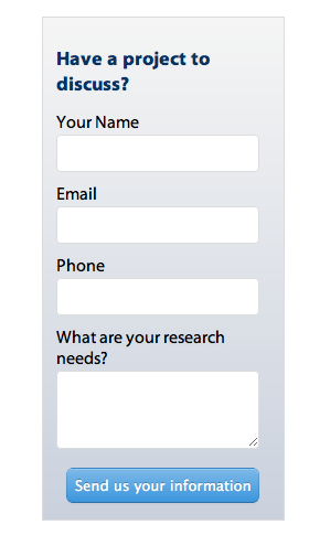
We also have a contact form on every page of the site. While I didn’t fully agree that it was needed, I did simplify it and made it smaller and less intrusive by placing it into a sidebar:
